Brand Identity Designer / Buffalo, NY
Brand Identity Designer / Buffalo, NY
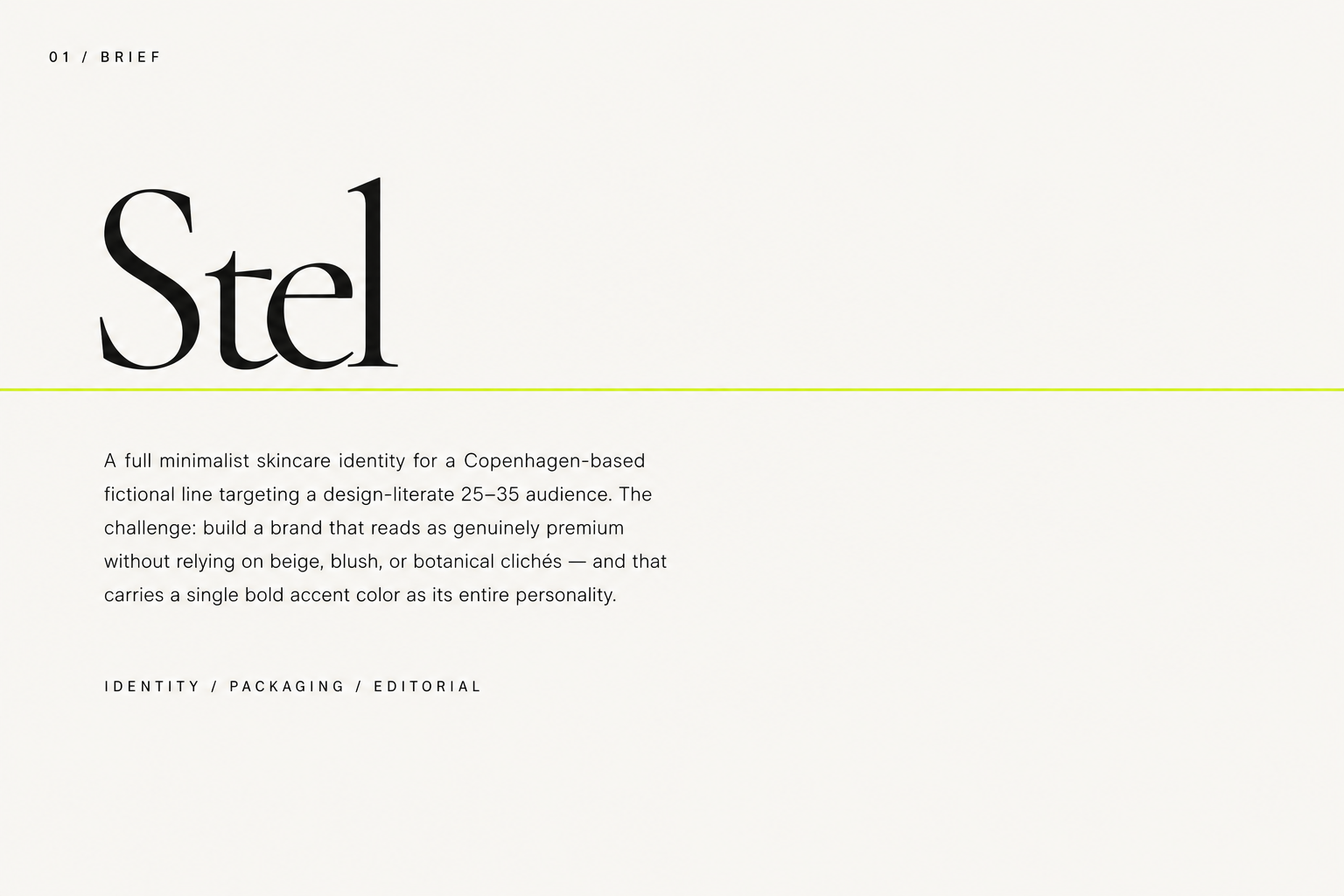
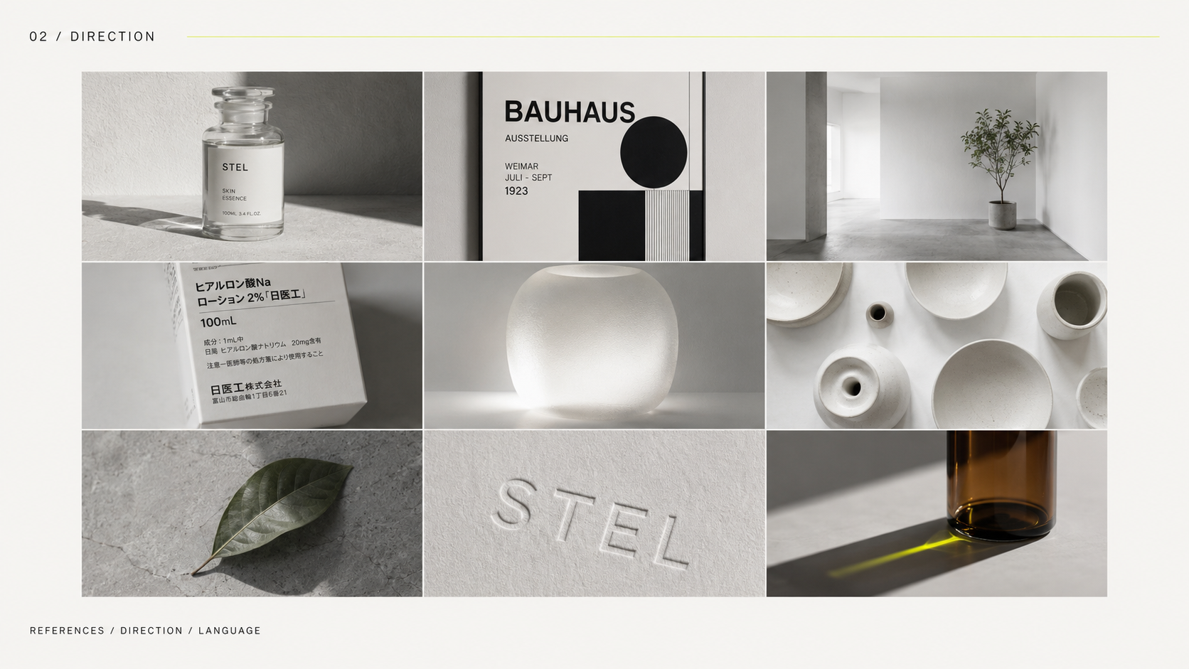
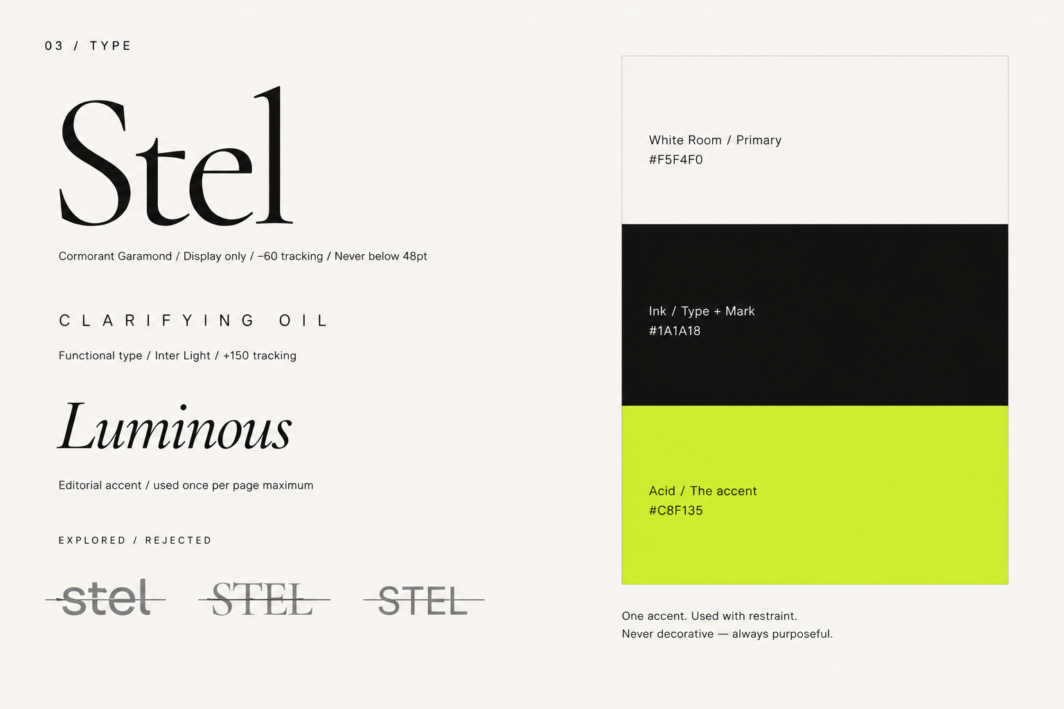
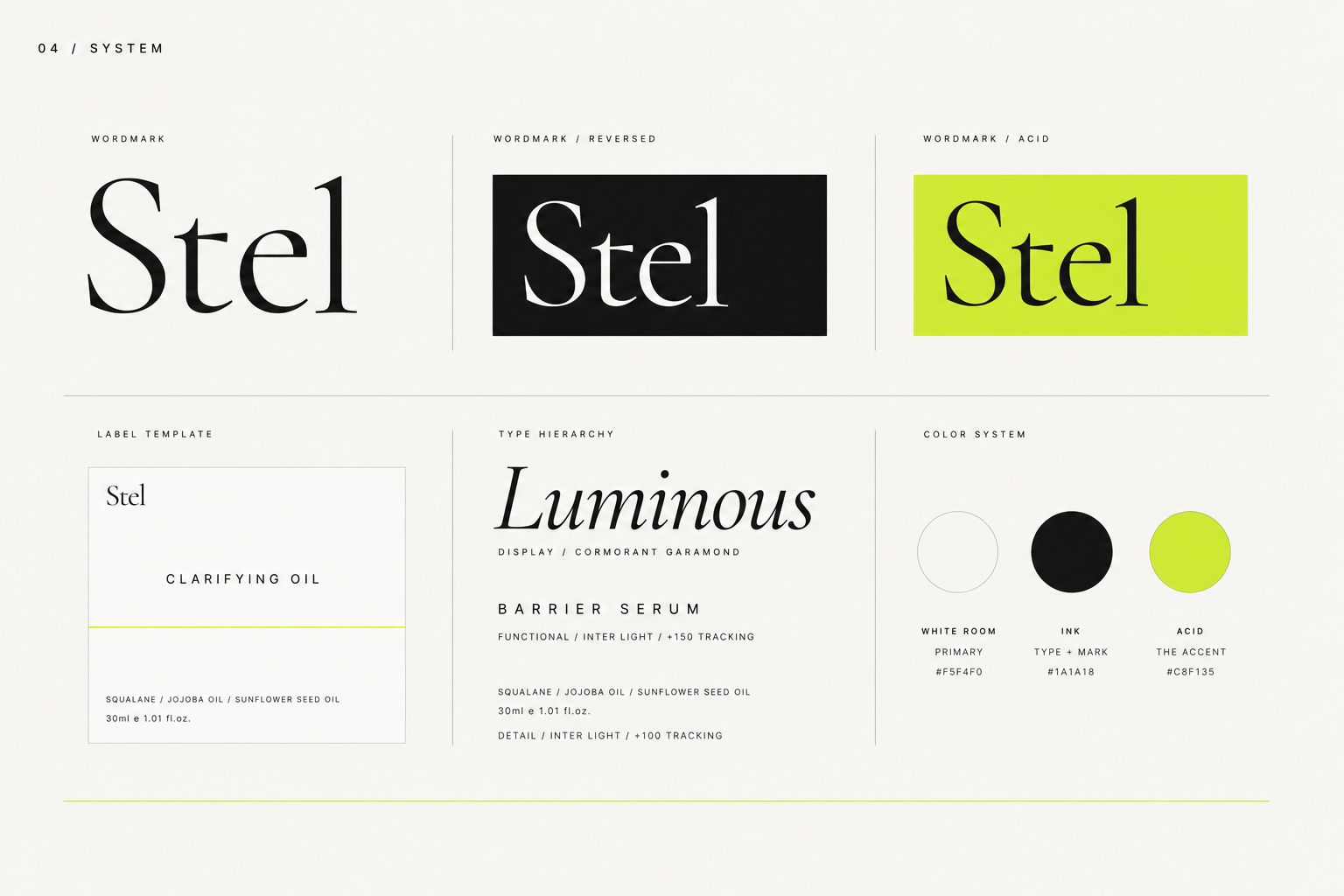
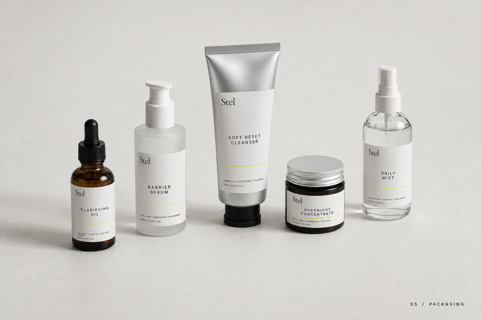
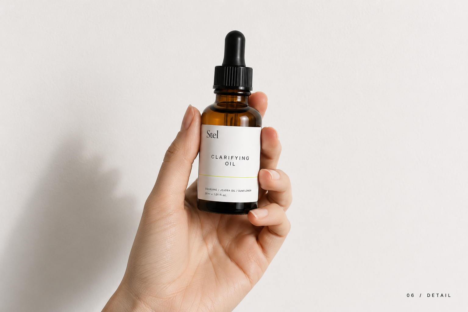
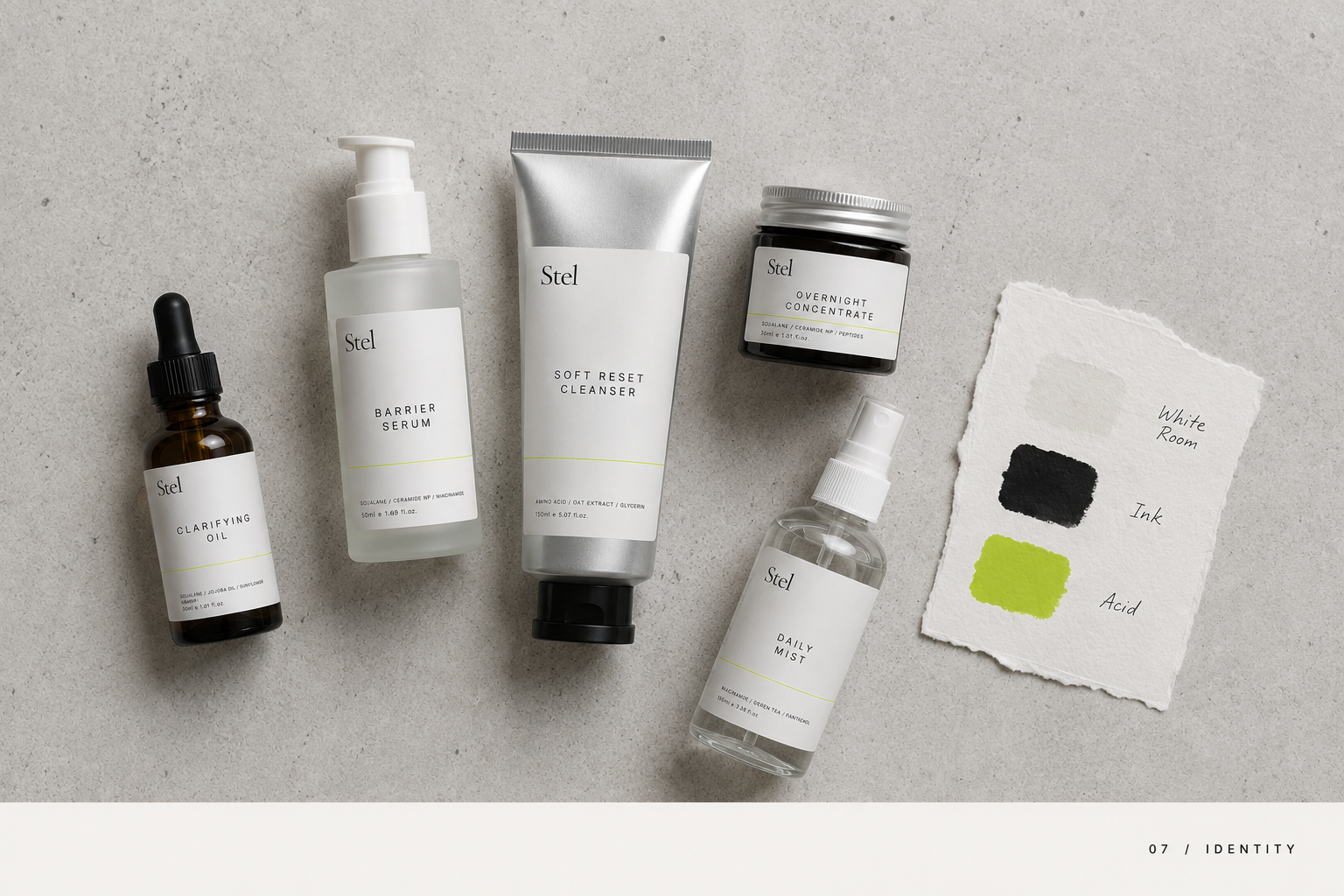
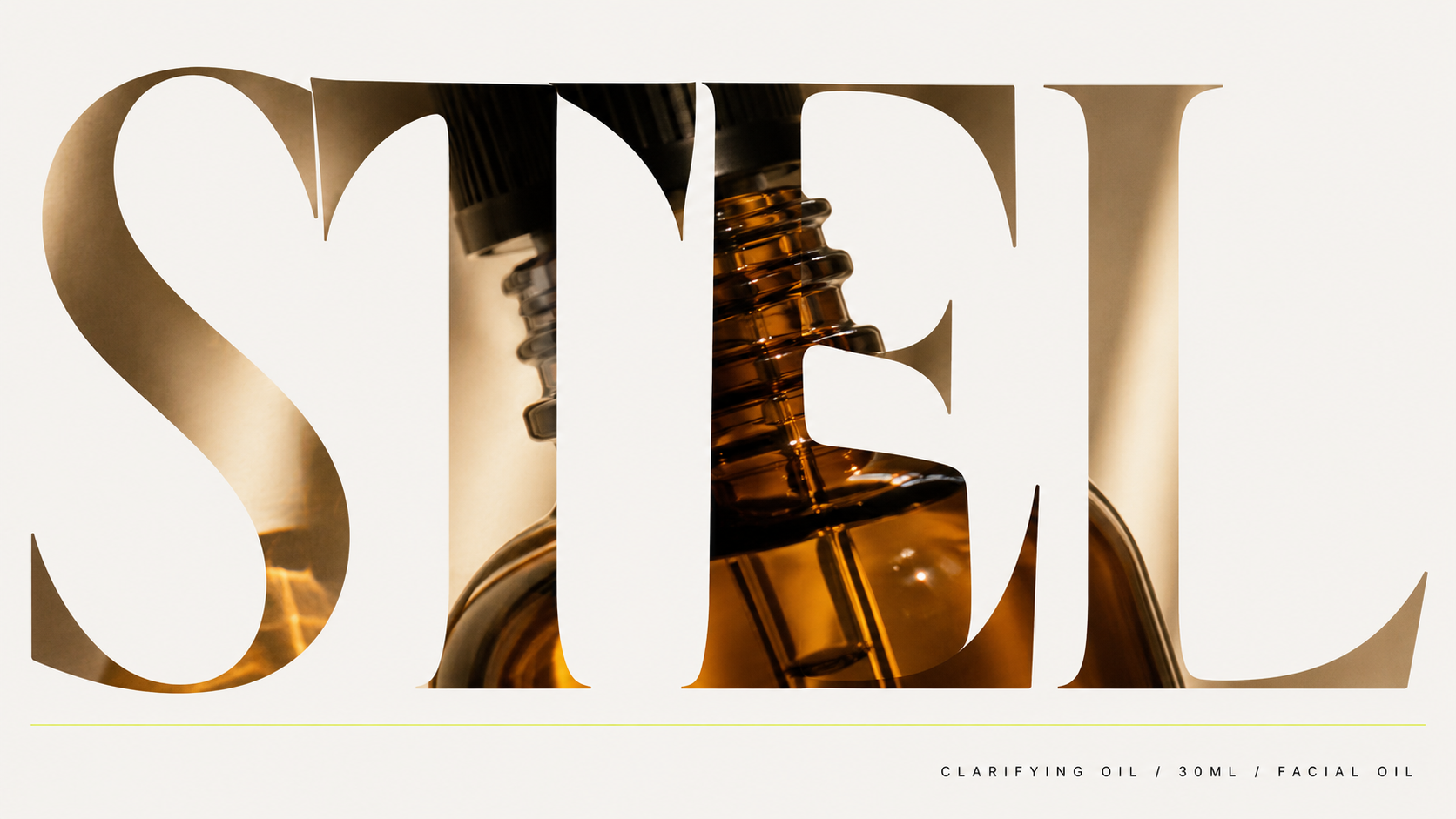
The skincare category is full of beige. STEL was designed to be its opposite — a full minimalist identity for a fictional Copenhagen-based line built around a single acid chartreuse accent against stark white, a Didone serif tracked to near-abstraction, and packaging so restrained it almost disappears on the shelf. Almost. More images of the packaging system are available at elianna.work.
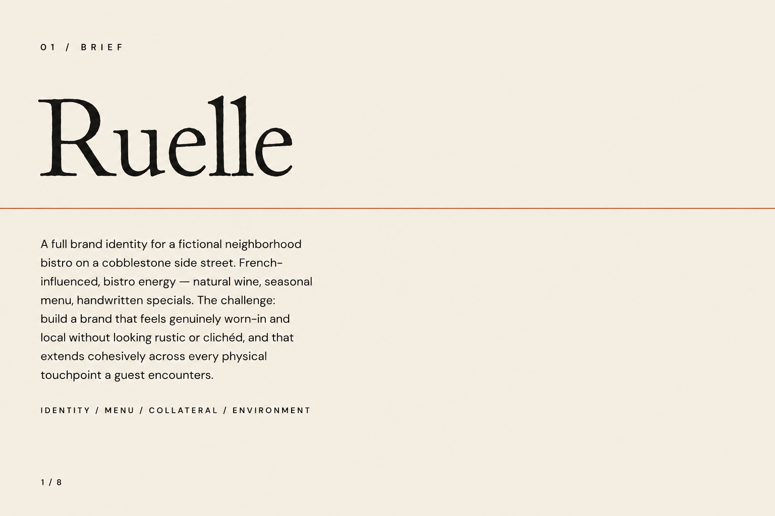
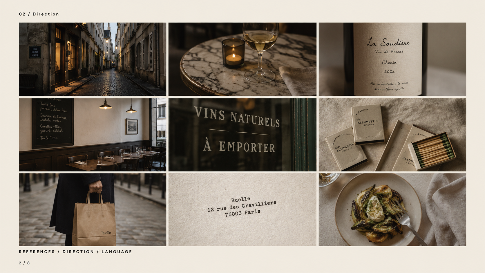
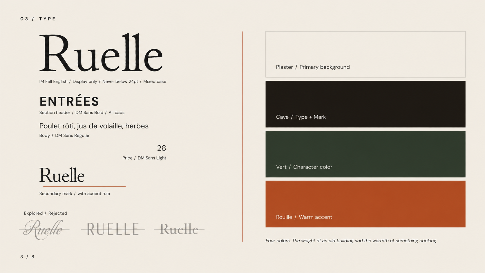
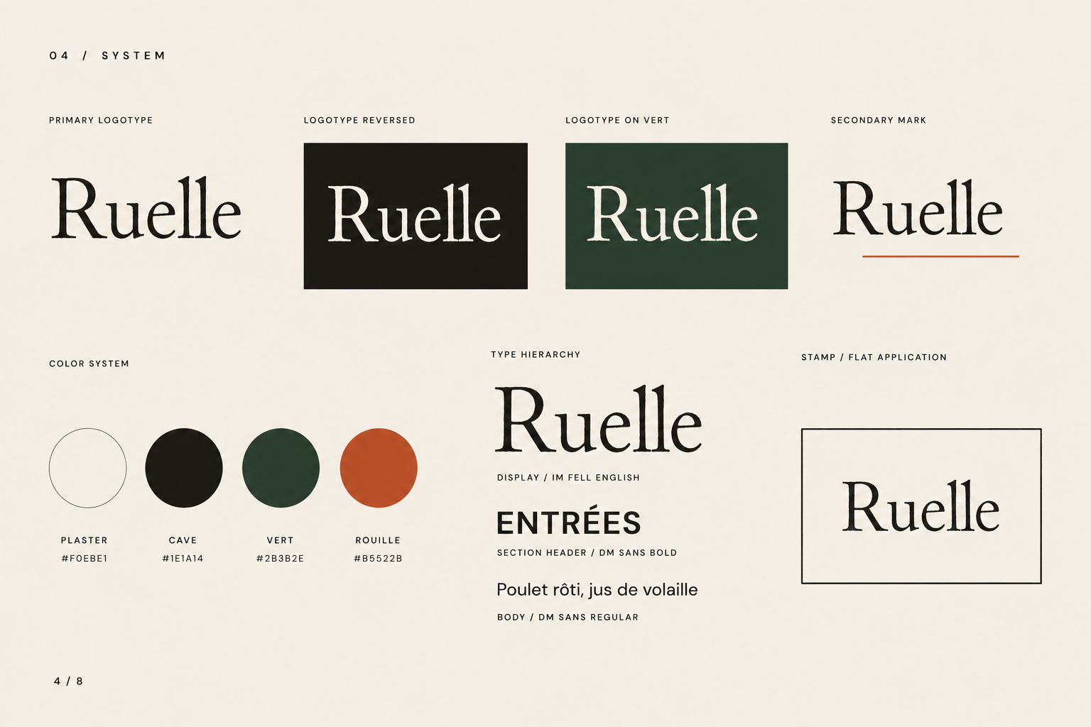
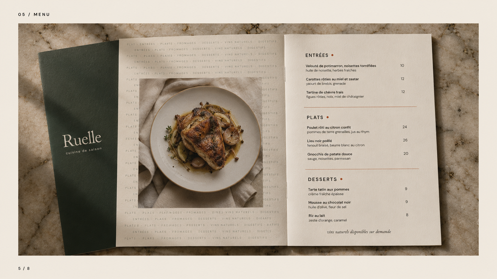
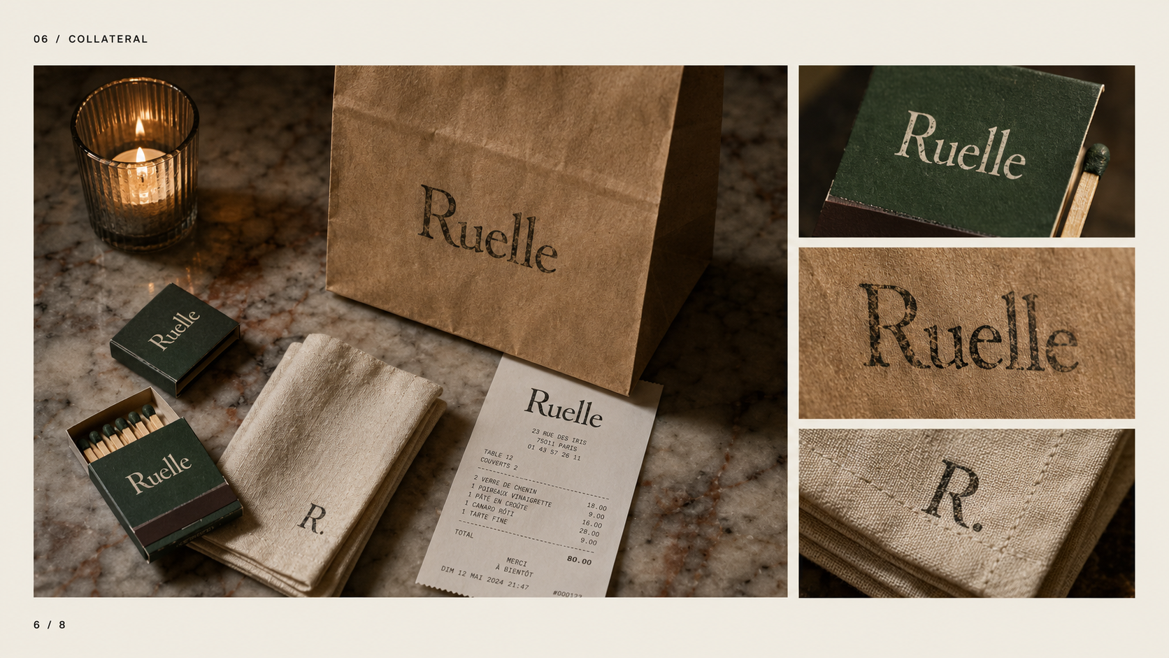
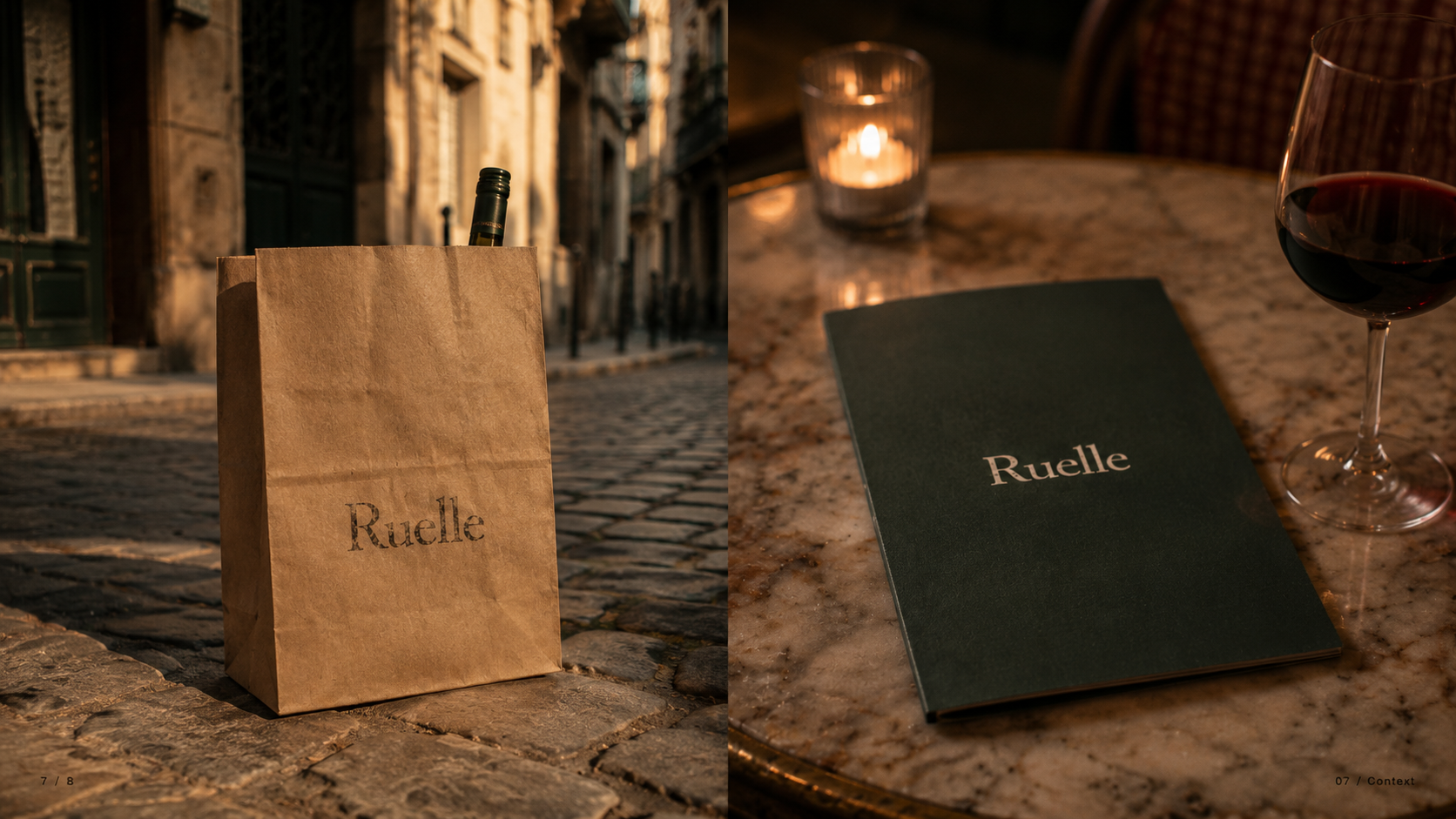
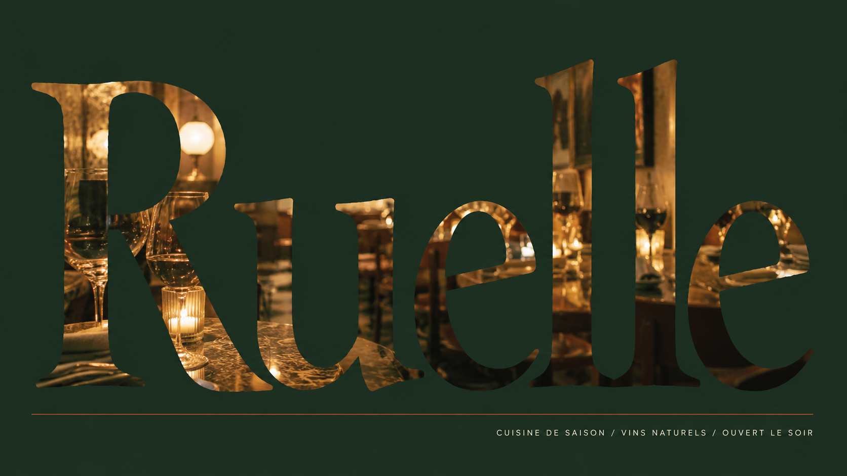
The best neighborhood restaurants don't announce themselves. They're on a side street, the sign is small, and you only know about them because someone who loves you told you. Ruelle is a brand identity built around that feeling — a French-influenced bistro with natural wine, a seasonal menu, and a name that means the alleyway you'd walk down to find it. The identity extends across every physical object a guest encounters: the menu in their hands, the matchbook in their pocket, the stamp impression on their receipt.
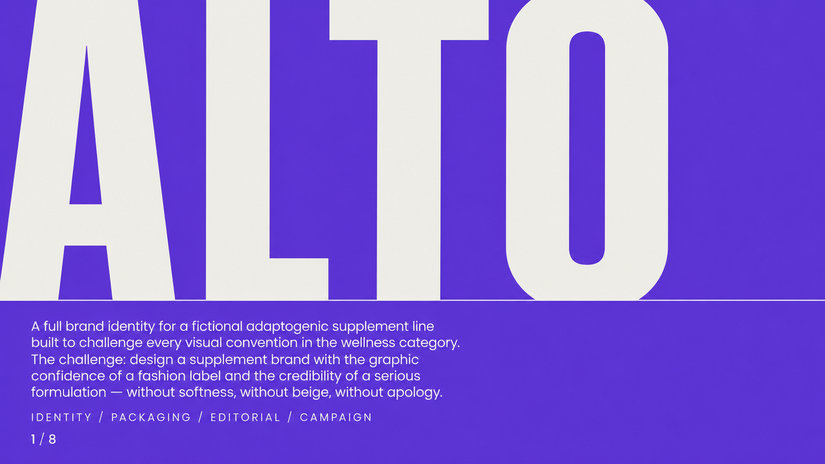
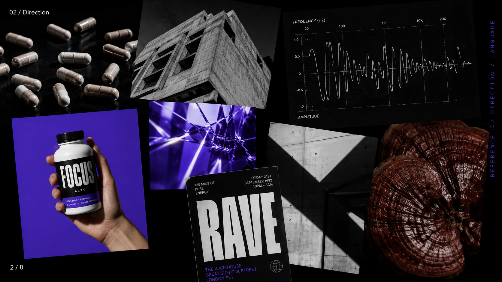
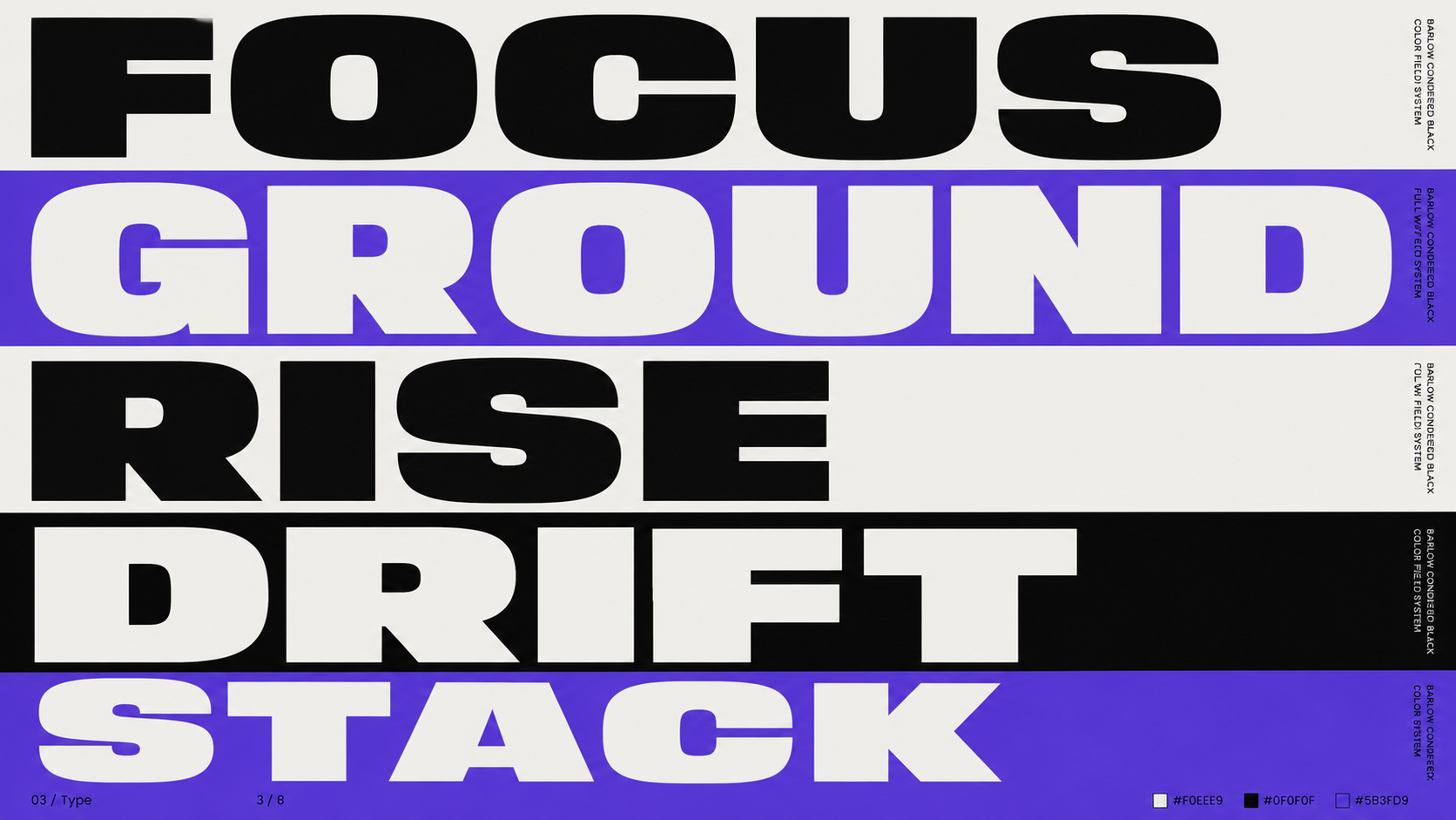
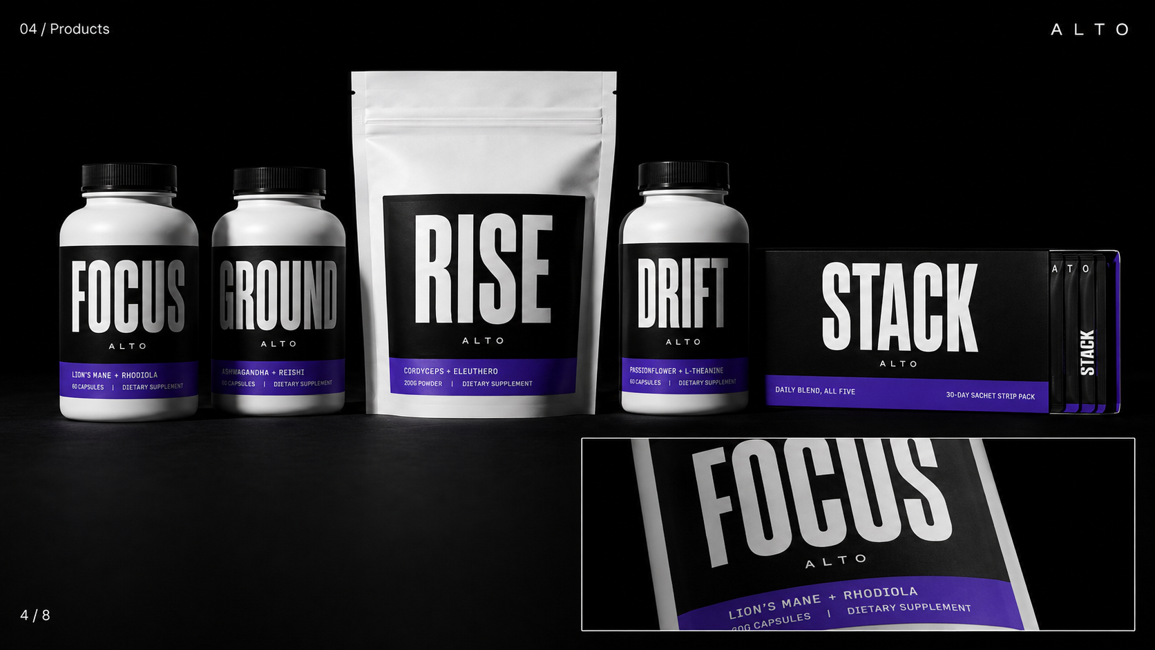
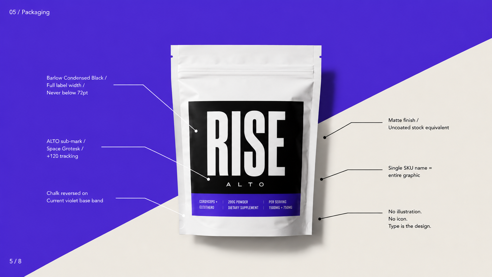
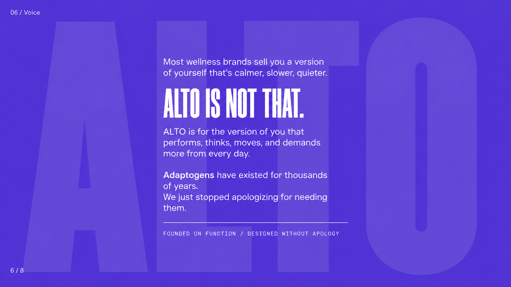
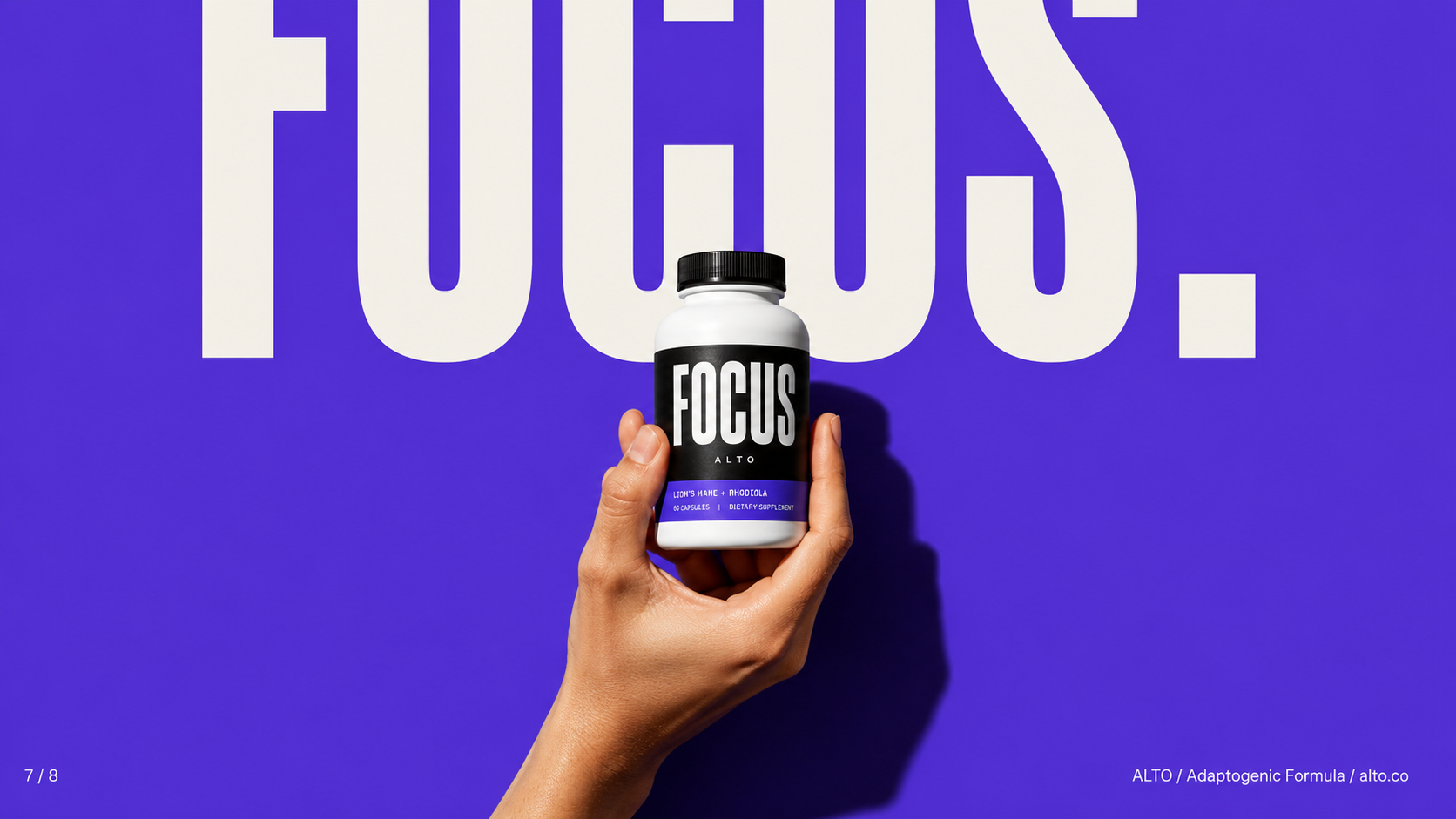
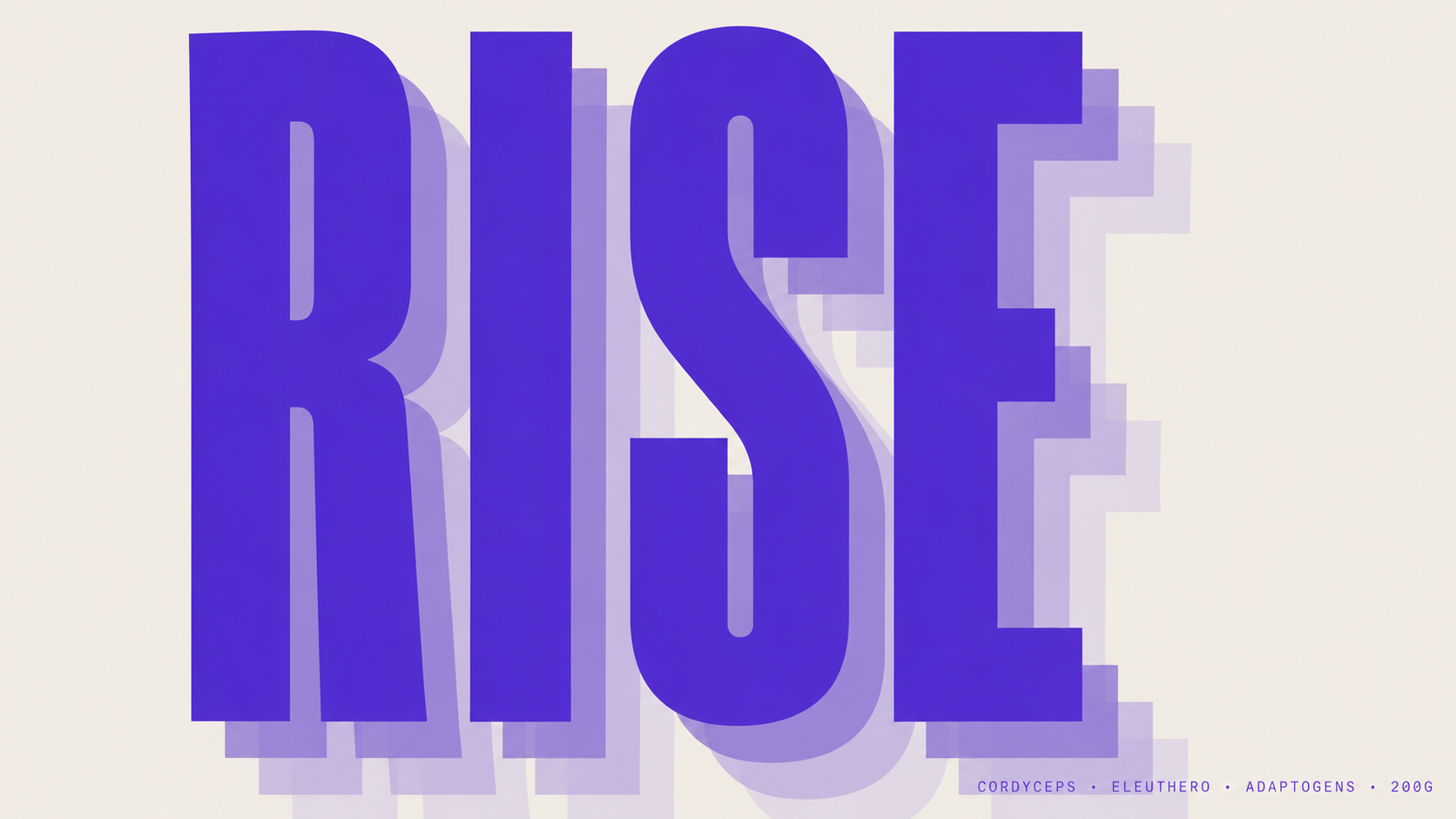
The wellness supplement category is saturated with earthy palettes, soft typography, and apologetic branding. ALTO was designed to reject all of it. Built around a single electric violet and a compressed grotesque typeface pushed to its graphic limits, ALTO is a supplement brand with the visual confidence of a fashion label. The identity system spans product naming, packaging, brand voice, and campaign — each element designed to perform as hard as the formulations inside.
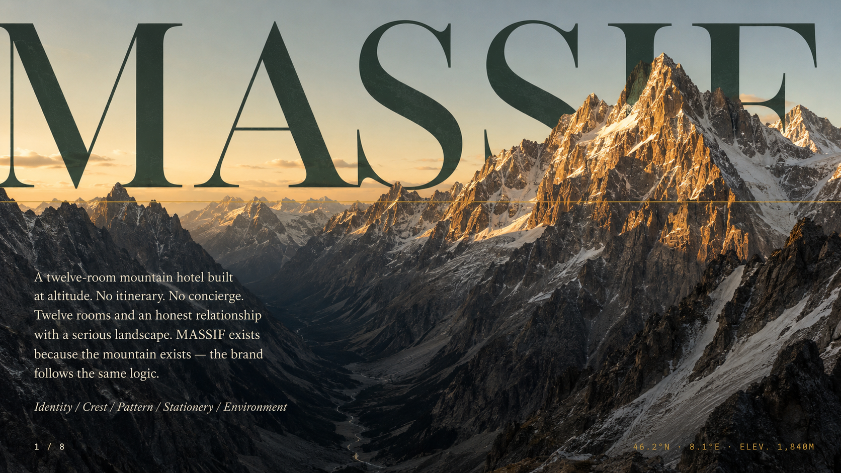
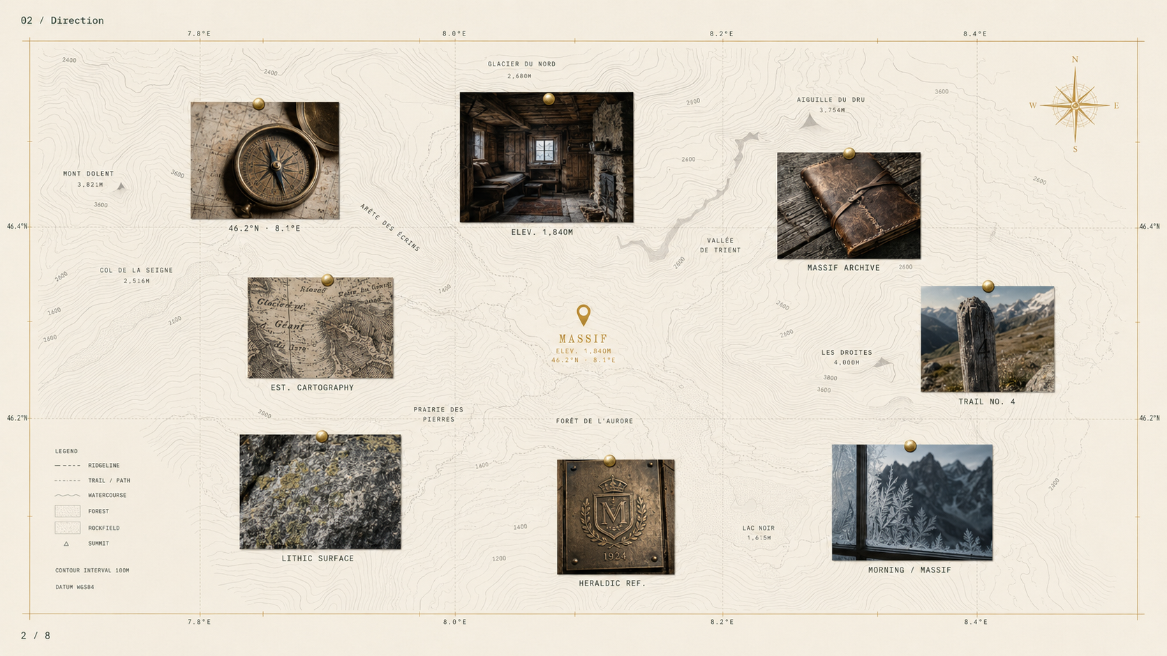
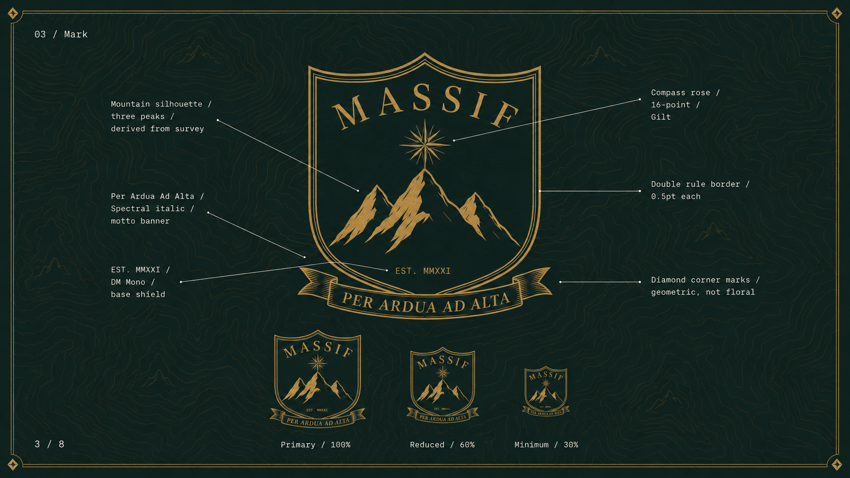
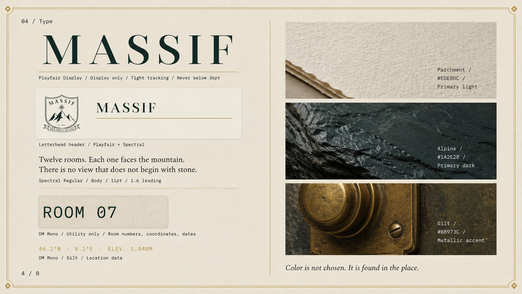
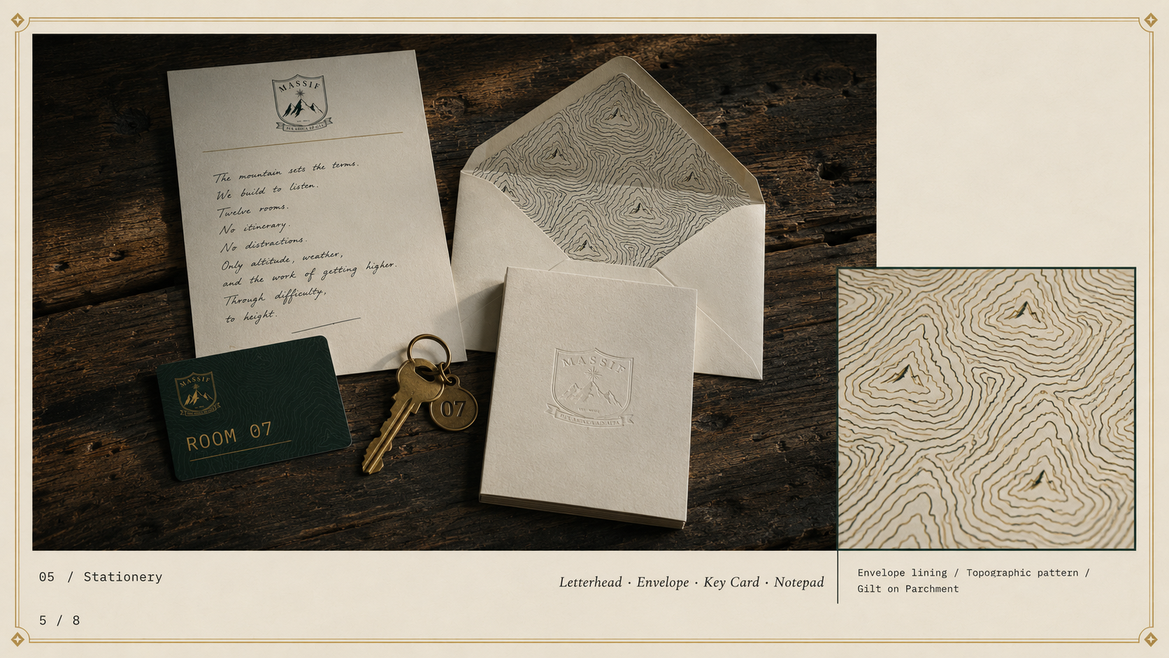
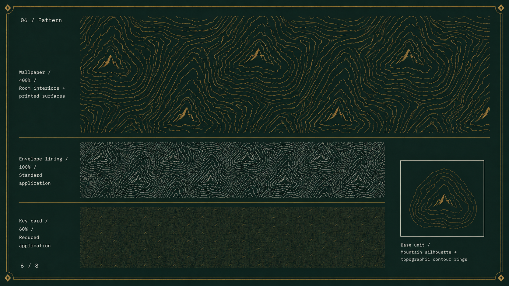
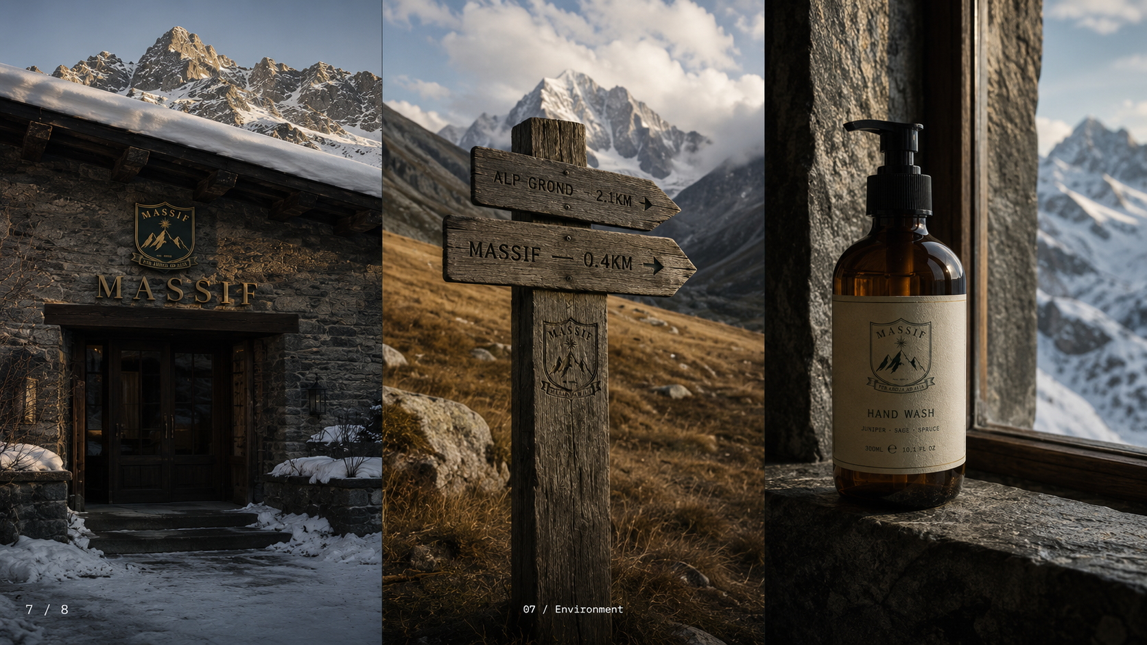
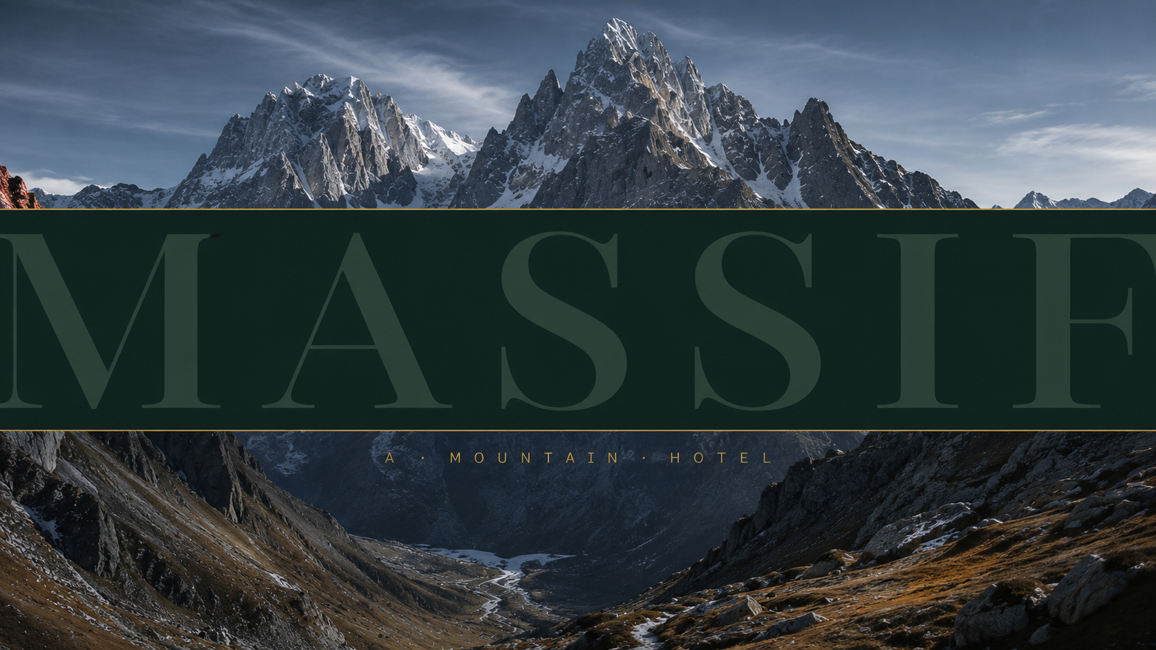
Some places demand to be taken seriously. MASSIF is a twelve-room boutique mountain hotel built at altitude — no itinerary, no concierge, just an honest relationship with a serious landscape. The identity system was built to match: a fully illustrated heraldic crest, a topographic brand pattern derived from the mark, a stationery suite printed on materials that feel like the place, and a typographic system that borrows its logic from cartography and expedition equipment. Every detail references the mountain. None of it is decoration.
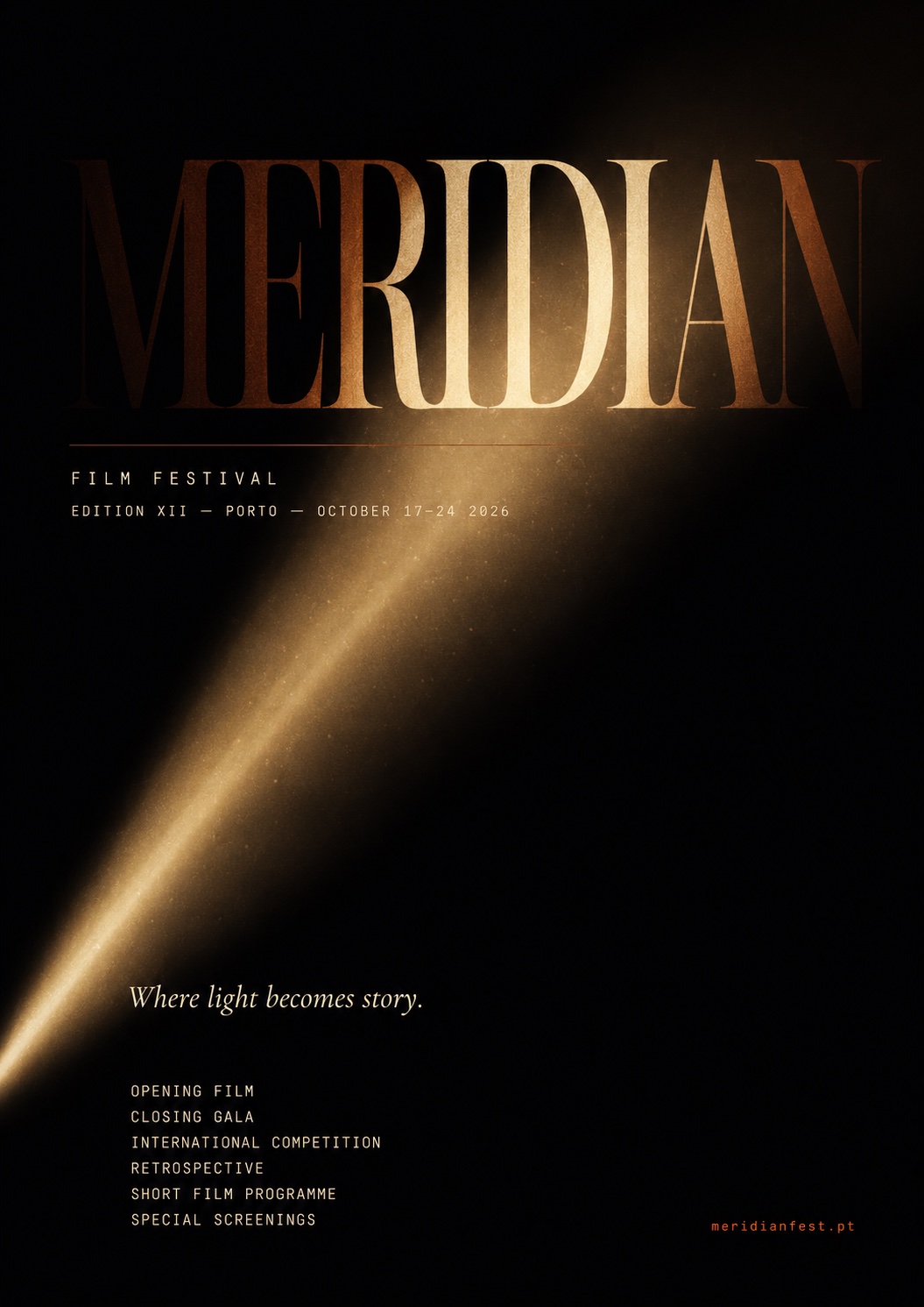
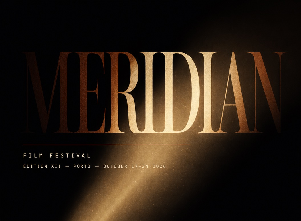
A poster for a fictional international film festival. The brief was entirely self-imposed: one surface, one idea, one composition. The projector beam is the concept — light cutting through darkness, illuminating language before returning it to the dark. Everything else follows from that single decision. The beam is not decoration. It is the structure.
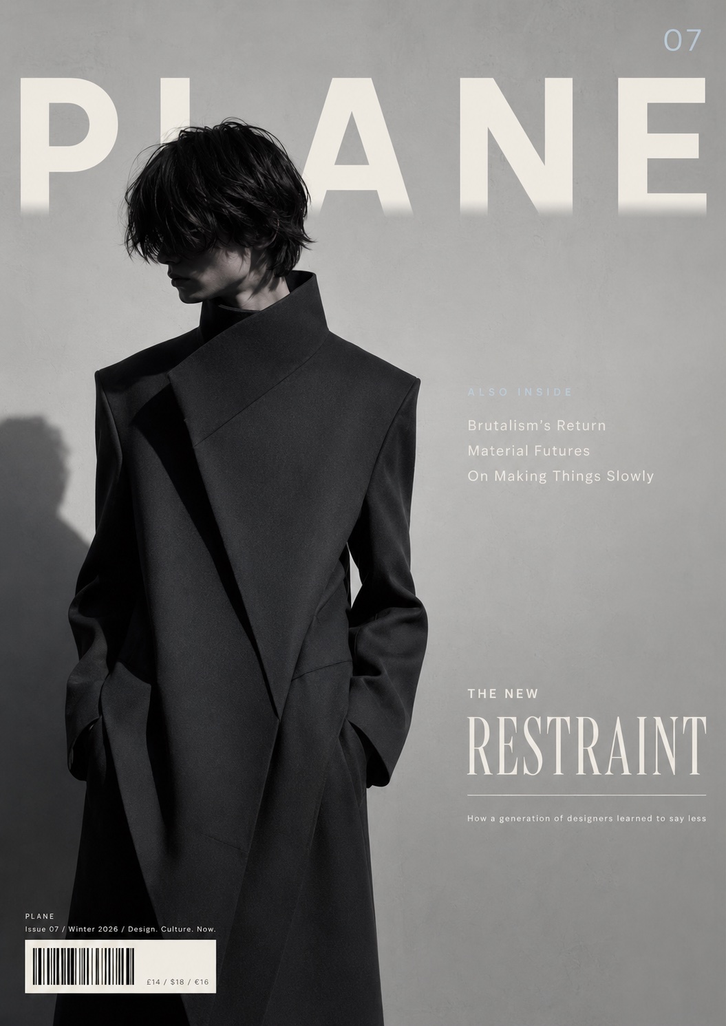
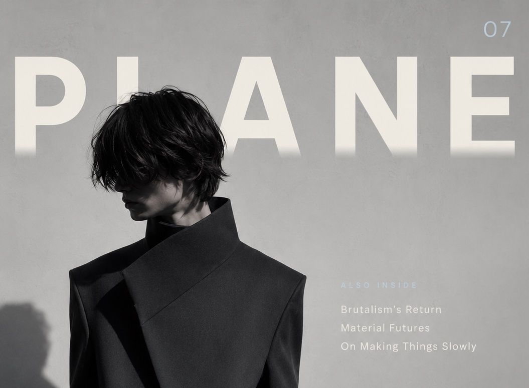
A cover design for PLANE, a fictional independent design and culture quarterly. The brief was self-imposed: work within every convention of magazine cover design — masthead, cover lines, barcode, price — while making something that feels genuinely cold, precise, and editorial. The masthead bleed, the two-weight cover line, and the single ice-blue accent are the three decisions the cover is built around.
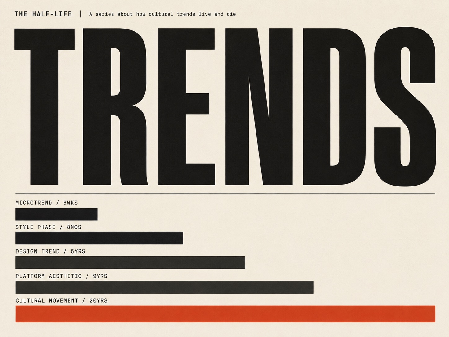
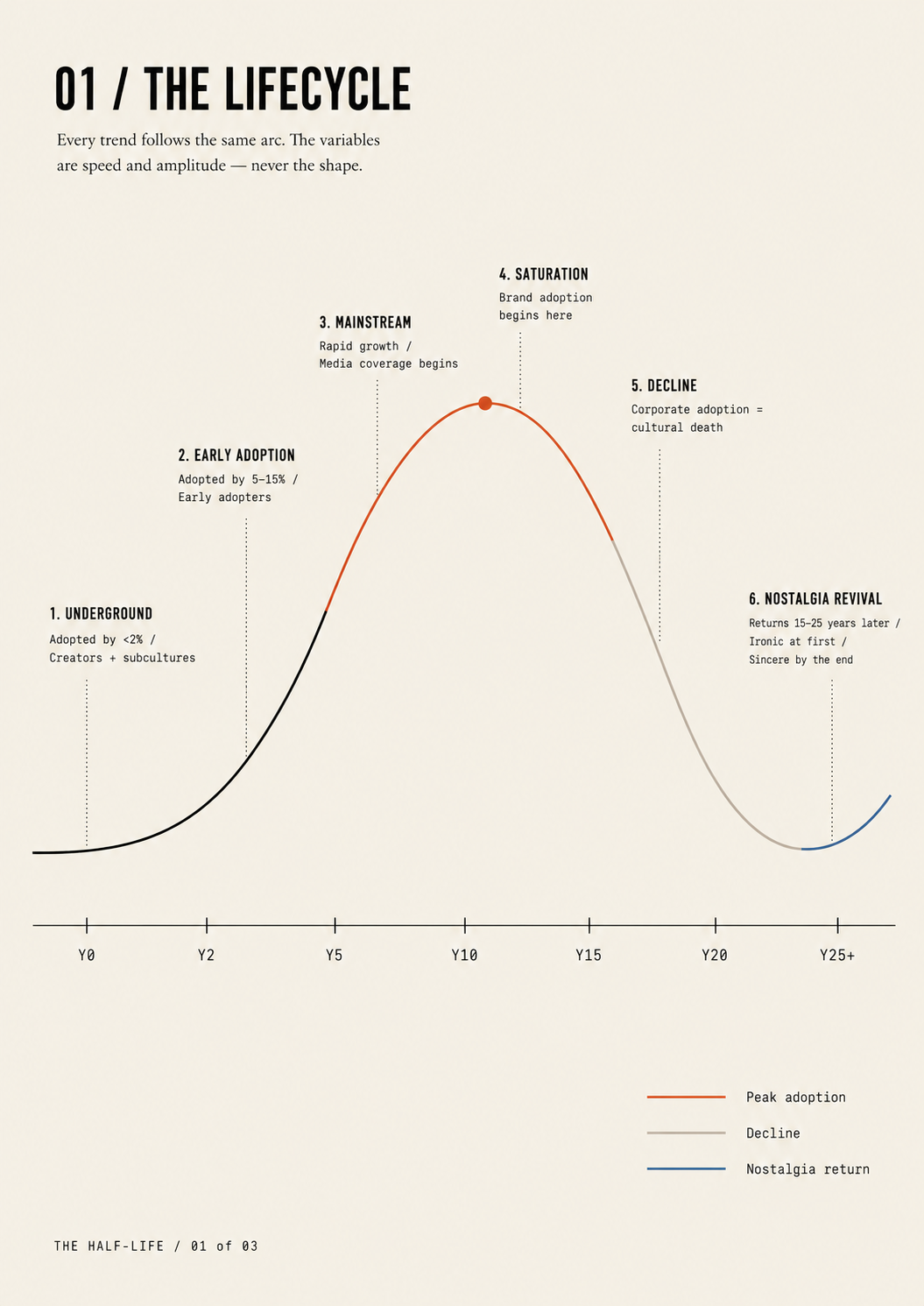
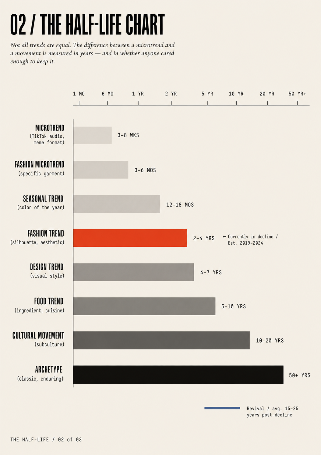
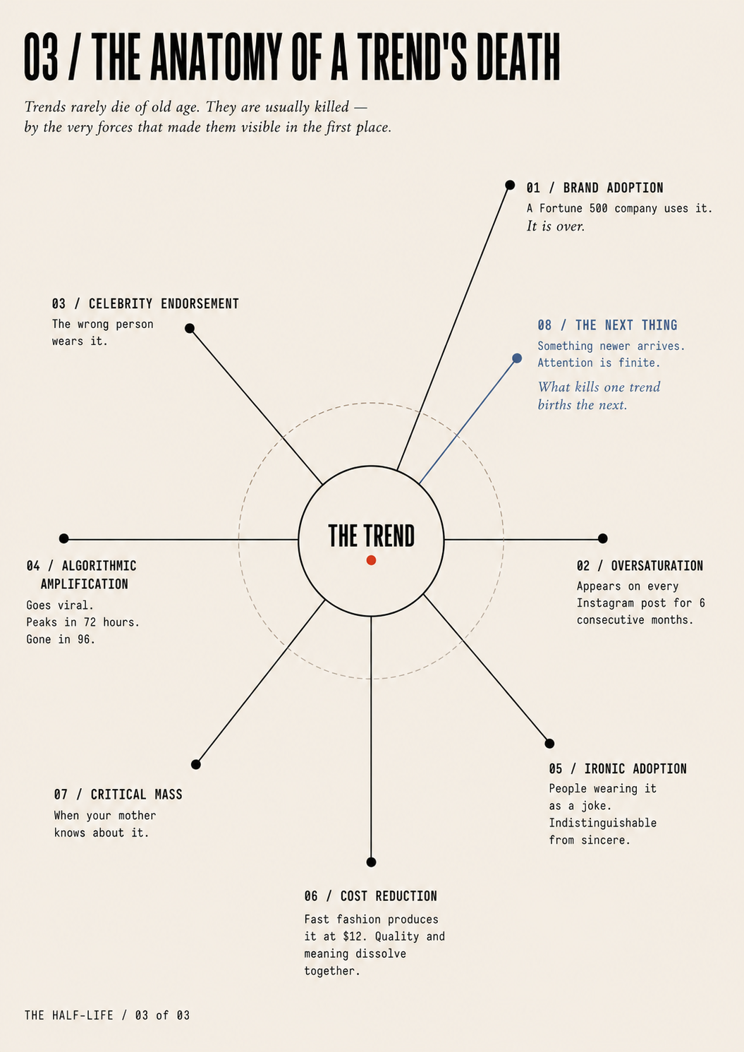
THE HALF-LIFE is a three-part data visualization series about how cultural trends are born, peak, and die. Three completely different visualization formats — line chart, bar chart, radial diagram — applied to the same subject. The subject is quietly self-aware: a designer who understands how trends die is less likely to chase them.
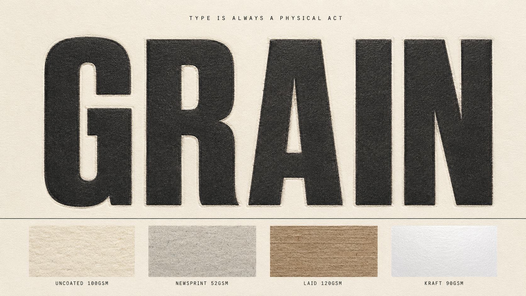
Type
Brand and identity designer based in Buffalo, NY. I work at the intersection of typography, visual systems, and the kind of brands people actually feel something about — beauty, food, hospitality, lifestyle. Founded Her Brand Kit, a boutique studio serving beauty professionals who need high-end identity work without agency timelines. Currently finishing a BS in Graphic Design at Full Sail University and seeking a junior role at a branding or identity studio.
Skills & Tools
Currently
Available for junior roles / Open to freelance